The Color Matching Problem (And Why It Matters More Than You Think)
Share
When you order a backdrop, you’re not just buying a piece of fabric. You’re commissioning a visual experience. Whether you’re designing a touring stage show, a television studio, or a branded event, consistency of color can make or break the moment. And yet — color matching remains one of the most frustrating, overlooked pain points in the entire production pipeline.
That’s where Big Image — and by extension, Drama Supply — comes in.
🧠 Color Isn’t Just Visual — It’s Emotional
Ask any scenic designer what they fear most, and “the red didn’t match” is probably near the top of the list. A rich burgundy in pre-production becomes a dull maroon on stage. A slate-blue wall in the 3D render suddenly turns baby blue under the wrong lighting.
Why? Because color isn’t just a hexadecimal value. It’s a living, breathing experience that’s affected by ink type, fabric absorption, ambient lighting, and even folding and shipment conditions.
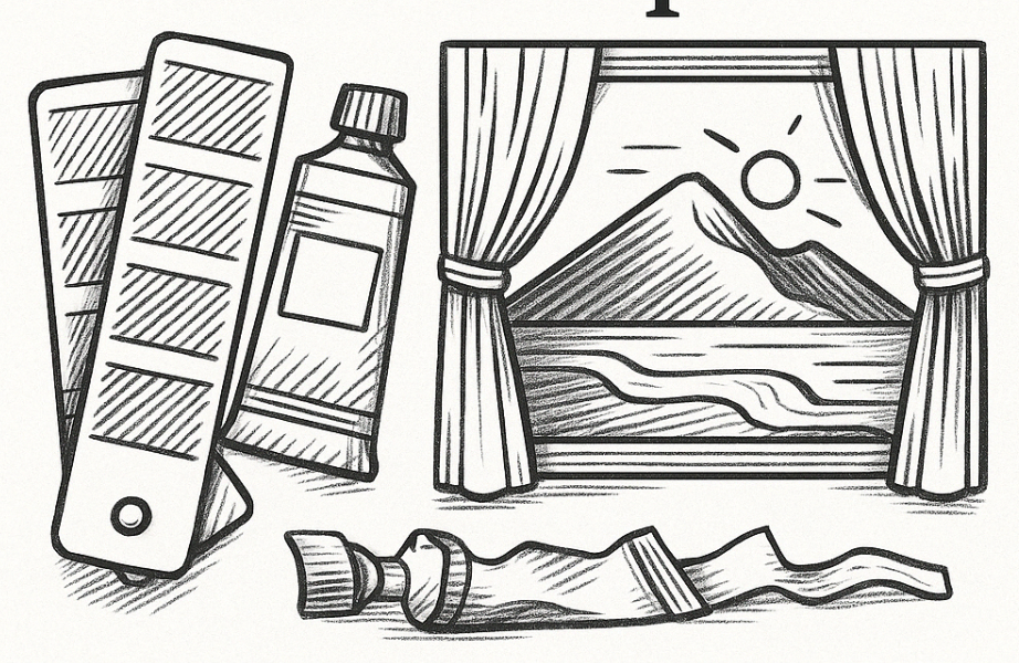
🖨️ The Big Image Difference
Big Image works at a scale — and precision — few other companies can match. Using industrial-grade printers capable of up to 5 meters wide, the process involves not only massive print formats, but also material-specific color profiling. Every backdrop is calibrated according to how a particular fabric absorbs ink, how it reflects light, and how it will look in context (not just in a controlled lab).
When you order through Drama Supply, you're not just getting access to Big Image's equipment. You're getting access to the calibration process itself. That means when you say "I need the blue to match the blue we used at our London show two years ago," we can actually do that.
🧵 Fabric Matters, Too
Not all fabrics treat ink the same way. A UV print on Artist Heavy will look different than a dye-sublimated design on Luna Blockout. That’s why we offer real support when it comes to matching materials — including sample prints, fabric comparisons, and one-on-one consultations with our team.
Want to use a frontlit scrim for Act I and a blockout drop for Act II — and have them feel like they’re part of the same world? We can do that.
🎬 It’s Not About Perfection. It’s About Trust.
Color matching is messy. There’s no magic bullet. But when you work with people who take it seriously — when your supplier actually gives a damn — suddenly, you’re not crossing your fingers when the truck arrives.
You’re unpacking, hanging, and getting on with the show.
At Drama Supply, we’ve handled backdrop needs for some of the world’s most technically demanding tours, studios, and theatres. If color matters to you, it matters to us.